Jakob Russell · 9 October 2026
Leveraging Visualization Layers for Spotting Ranking Fluctuation Triggers Across Enterprise Sites
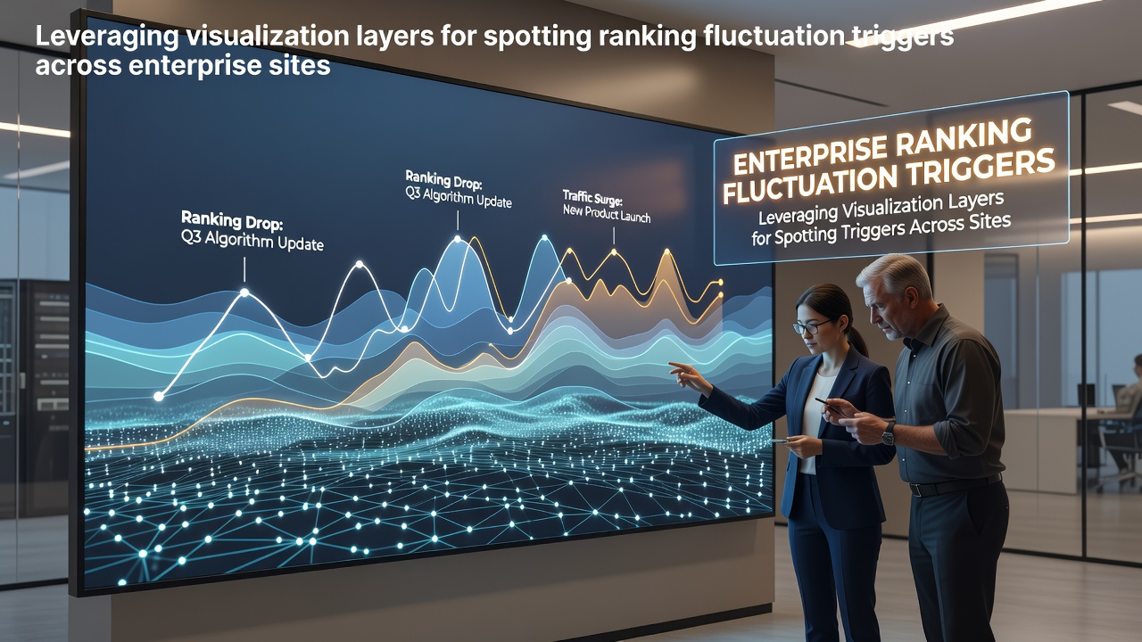
Enterprise websites face ranking fluctuations triggered by algorithm shifts, content updates, technical changes, and external signals, while visualization layers help analysts isolate these causes through stacked data representations that combine traffic trends with crawl logs and SERP positions.
Researchers at major institutions have documented how multi-layered charts reveal patterns that single-metric views often miss, and teams apply these methods to sites with thousands of pages where manual review becomes impractical.
Core Components of Visualization Layers in Enterprise SEO
Visualization layers stack different data sets such as ranking positions, page speed scores, backlink acquisition dates, and indexation status onto shared timelines, which allows observers to correlate events without switching between separate tools or spreadsheets. Analysts overlay heat maps for volatility scores on line graphs for average rankings, and the resulting views highlight clusters where multiple triggers coincide.
Those who study large-scale search performance note that color-coded regions within these layers draw attention to spikes in fluctuation frequency, while zoomable interfaces let users drill from site-wide overviews down to individual URL groups.
Common Triggers Detected Through Layered Analysis
Algorithm updates represent one frequent trigger, and visualization layers capture their impact by showing simultaneous drops across content categories that share similar structural signals, such as thin pages or slow-loading templates. Site migrations produce another set of patterns when URL structures change without proper redirects, and the layers display clear breaks in ranking continuity at the migration date.
Content refreshes can also surface as triggers when new material fails to align with existing topical clusters, and analysts spot these through layers that combine keyword density metrics with ranking velocity indicators. External factors like competitor content launches appear when layers include share-of-voice comparisons that suddenly shift in favor of rival domains.
Practical Implementation Steps for Enterprise Teams
Teams begin by exporting data from multiple sources into a unified visualization platform, then configure layers for each metric type before aligning timestamps across all sets, and this process reveals correlations that isolated reports leave hidden. Automated alerts tied to layer thresholds notify analysts when volatility exceeds baseline levels for specific page cohorts.
One study from academic researchers demonstrated how layering crawl budget consumption data over ranking curves helped identify server response issues that preceded ranking losses on high-volume enterprise domains.
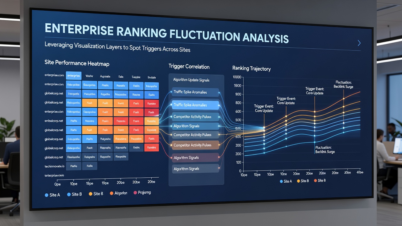
Enterprises operating in October 2026 saw increased adoption of these layered approaches following widespread core updates that affected multiple verticals simultaneously, and the visualizations enabled faster root-cause identification compared with traditional reporting methods.
Integration With Existing Analytics Workflows
Visualization layers integrate directly with existing enterprise dashboards through API connections that pull real-time ranking data alongside historical crawl records, and this connectivity reduces the time required to move from observation to diagnosis. Analysts apply filters within the layers to isolate mobile versus desktop performance, which often uncovers device-specific triggers missed in aggregate views.
Data from the European Commission reports on digital platforms shows how structured data presentation improves decision accuracy in complex online environments, and similar principles apply when enterprise teams examine ranking stability.
Case Examples From Large-Scale Sites
Observers documented one enterprise retail site where layered visualizations pinpointed a sudden ranking drop tied to image compression changes that inadvertently affected alt-text indexing, and the layers combined performance metrics with search console data to confirm the link. Another case involved a media property that used timeline overlays to trace ranking volatility to a shift in internal linking structures introduced during a site redesign.
These examples illustrate how the approach scales across industries where page counts reach tens of thousands and manual correlation becomes unfeasible.
Conclusion
Visualization layers provide structured methods for connecting ranking fluctuations to their underlying triggers on enterprise sites, and continued refinement of these techniques supports more precise responses to search performance changes as data volumes grow. Teams that adopt layered analysis gain clearer views of the relationships between technical, content, and external factors that influence rankings over time.